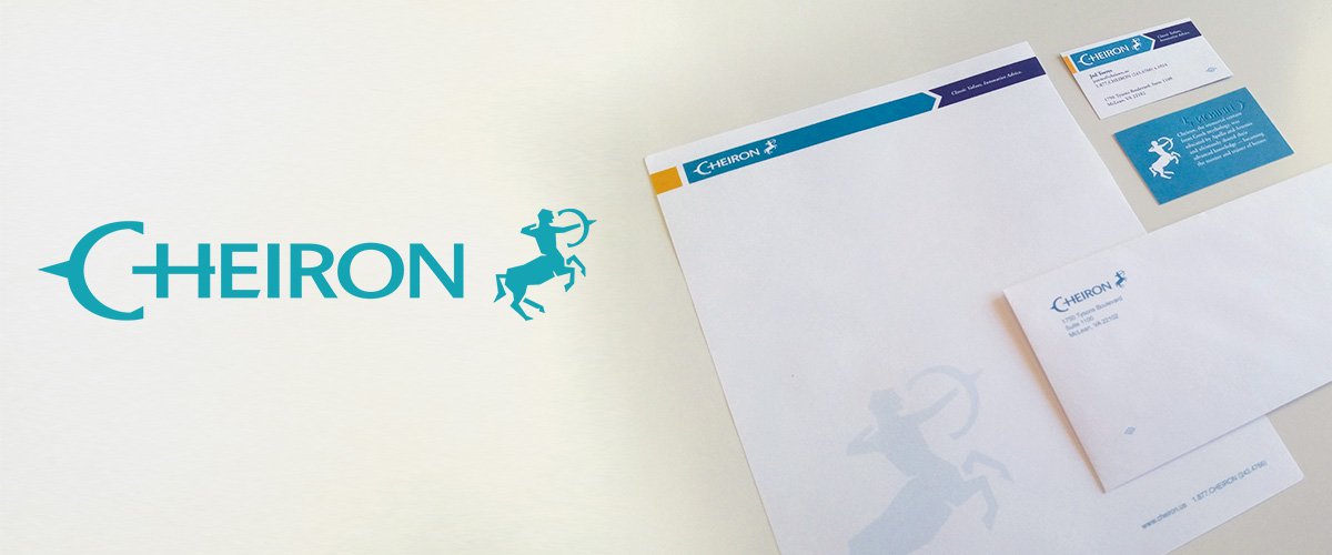
Cheiron
Logo, brand identity, and printed marketing materials for nation-wide actuarial firm Cheiron.
Cheiron, an actuarial firm headquartered in Virginia, needed an updated look for their growing company.
We began by conducting phone interviews with several employees and the CEO to learn what sets Cheiron apart from its competitors, what their clients value most about them, and how they see their future as a company.
A common adjective used to describe Cheiron by everyone we interviewed was accuracy.
Cheiron's name comes from the Greek mythological centaur Cheiron who, after being educated by Apollo and Artemis, became the mentor or heroes.
The initial parameters for the redesign of the logo were simple: keep the essence of the centaur icon.
We decided to focus our design on the bow and arrow of the centaur to communicate the accuracy Cheiron is known for by both employees and clients.
We proposed a number of concepts to Cheiron.
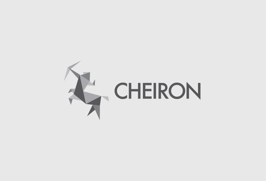
The centaur icon is solely comprised of triangles. All of the triangles are working together to distill a highly complex shape down to its simplest form in the most accurate and efficient way possible — communicating that you can accomplish something that’s highly complex if the pieces of the puzzle are accurate.
The centaur is depicted in an active stance — up on its hind legs with bow drawn. The bow and implied arrow are a visual metaphor for accuracy and trustworthiness — communicating there’s no one else you’d rather have by your side than someone this accurate.
The typeface used for the lettering portion of the logo accentuates the triangular form of the icon — see the points of the N, the R, and even the C. They echo the points in the triangles and unify the icon and wordmark as one.
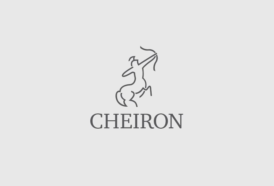
While still very stylized, this icon is more curvilinear in form and feels a little more naturalistic than the geometric form of concept A.
Again the figure is depicted in a very active stance — standing on his hind legs with arrow drawn. The bow and arrow serving once more as a visual metaphor for accuracy — you can trust this archer is going to hit his target.
This concept also evokes a very premium, high-end feeling. Cheiron is a high-end firm that hires the best people to tackle complexity and deal with high-profile clients. The style of this icon and the typeface used communicate these high-end attributes.
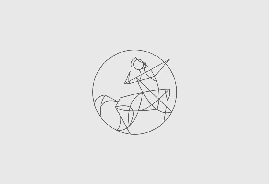
The centaur icon is very geometric and mathematically based. It evokes a feeling of precision.
The icon is bound by a circle that is broken by the arrow point - drawing attention to the bow and arrow and the sentiment of accuracy.
The icon is abstract, but still very recognizable as a centaur. It provides a distinct look.
Though Concept A was a favorite of the CEO, the other stakeholders wanted something less abstract.
Our new parameters were to create a less abstract centaur icon and also include the original typographic treatment for the wordmark.
We arrived at a rectilinear centaur icon composed solely of straight lines — a departure from the more naturalistic, curvilinear form in their original logo, but still not as abstract as the early concepts.
We adjusted the original wordmark to pair more effectively with the rectilinear shape of the icon.
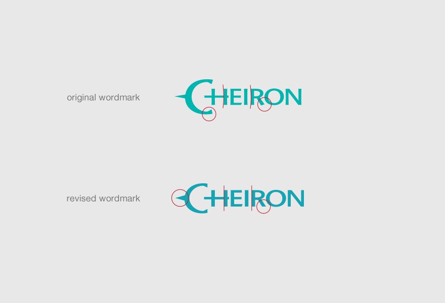
After unveiling the new concept to more of the employees, it was decided that the “C” from the wordmark should also serve as the bow and arrow as was done in the original logo.
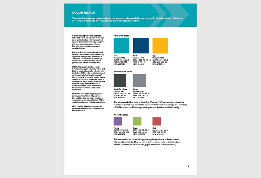
Once the logo was finalized, we moved on to color exploration. We adjusted the original teal color slightly and paired it with a dark blue and gold.
We then put together extensive branding guidelines to be used by employees and other marketing or design partners to ensure consistent and appropriate use of all branding elements.
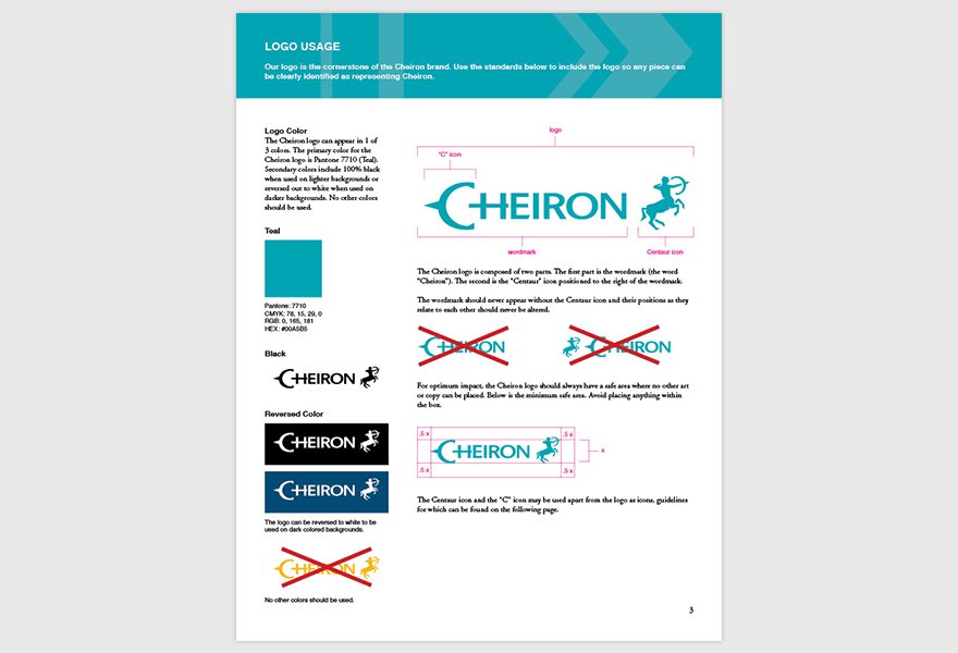
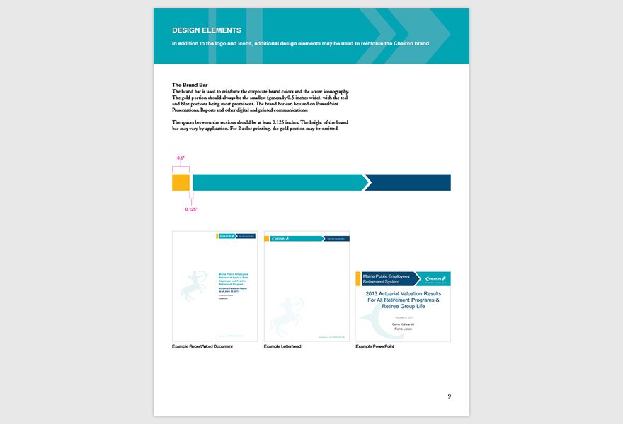
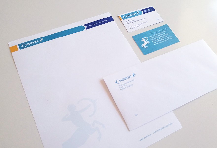
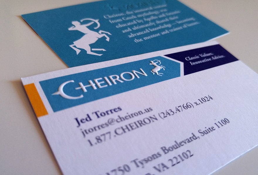
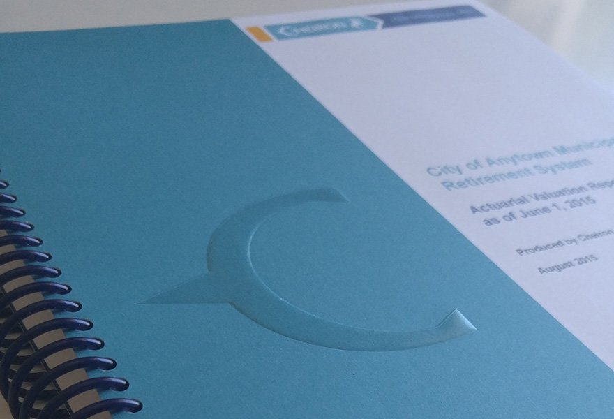
As our final stage in the rebranding process, we redesigned all of Cheiron’s digital and printed marketing collateral such as letterhead, business cards, report templates, PowerPoint presentations, and more.
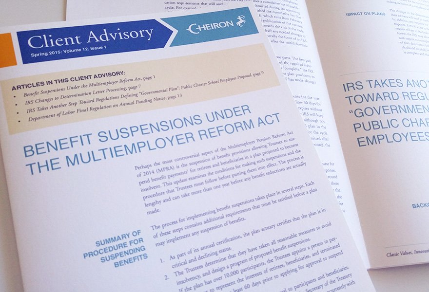
We also worked with Cheiron to transition from emailed Word documents as internal quarterly newsletters, to ESP-managed HTML emails.
See All Case Studies