6 Must-Haves for Donation-Driven Websites
We looked at 9 donation-driven, non-profit websites and noticed they all had these 6 things in common:
1. Donate button in the top right corner


Eye-tracking software and user studies continually show users view websites from top left to top right, then down, basically drawing the capital letter F.
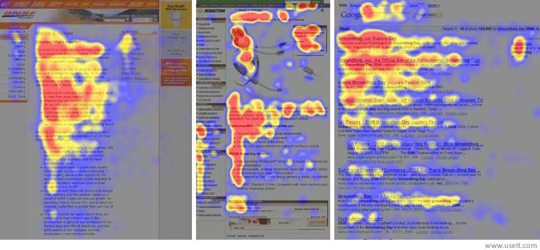
Putting your brand first in the top left, then your primary call to action in the top right, follows this reading pattern and ultimately results in a higher conversion rate.


World Vision populates a suggested donation amount in their button. Some research shows suggesting a donation amount will increase conversions. While not all studies agree, there is no evidence it hurts conversion, so it’s certainly worth a try!
2. Full-screen header image with a call to action overlay
More than just a current website trend, showing a full-screen photo or video of the cause you’re asking people to donate to brings your cause to life and can pull at viewers’ heart strings (and purse strings).
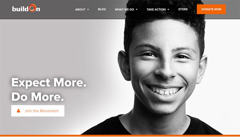
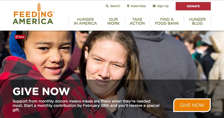
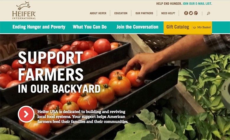
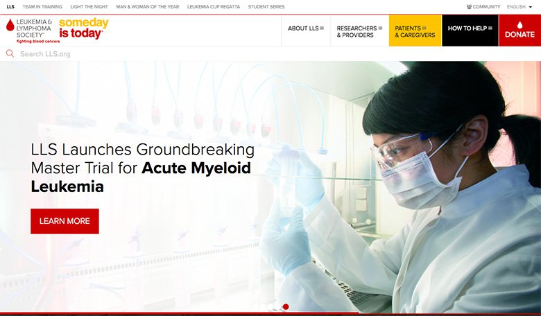
On all these examples, a secondary call to action was used directly over the image.
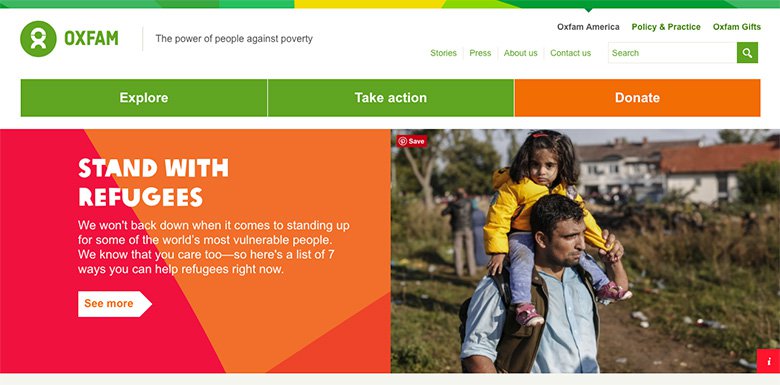
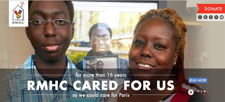


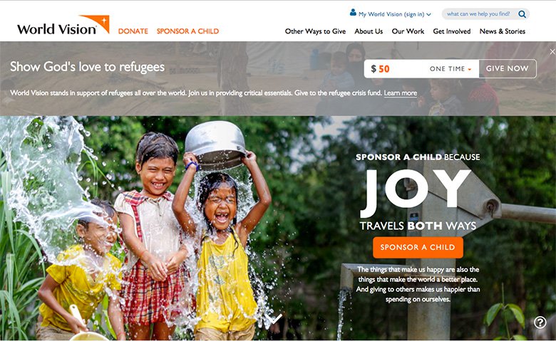
Whereas the primary call to action in the top right was donate or give, the secondary call to action was usually along the lines of "learn more" or "get involved".
3. Multiple secondary calls to action
Many of the sites we referenced included additional calls to action below the main header photo. This shows interested viewers what all of their options are to help the organization and could include things like volunteering and sharing socially.
4. Statistics
6 of the 9 sites we researched featured statistics on the home page about either the organization’s impact or cause-related facts.
Showing how donors’ money is used and the direct impact it has on the cause is a great way to show value and convince the viewer to donate.


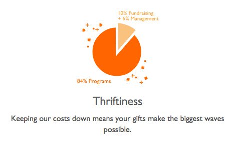
Showing cause-related facts shows how important it is to get involved.


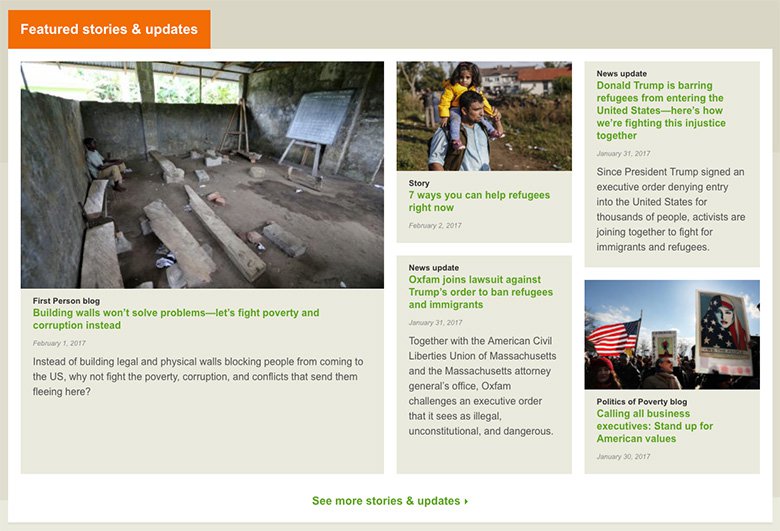
5. News articles or case studies about the work of the organization
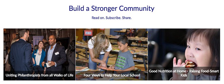
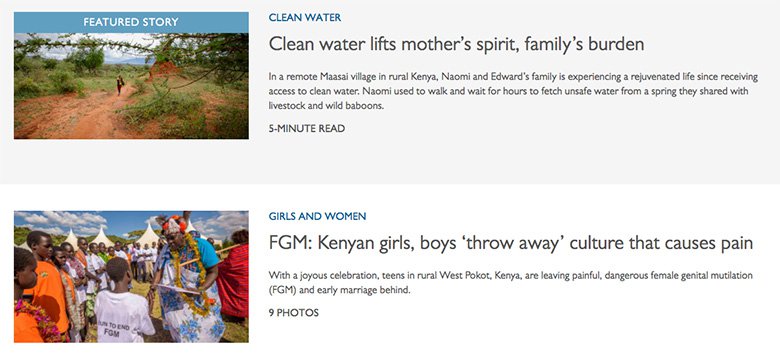
It’s always a good idea to feature recent blog posts or case studies on the home page of a website.
The sites we looked at showed updates on people and places impacted by donors and the work the organization is doing.
Showing recent blog posts keeps the site current — which is great for viewers and for SEO!
Here are the different ways the sites we looked at displayed news and blog posts:
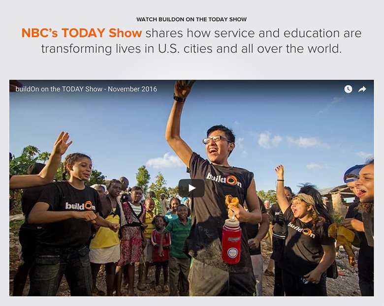

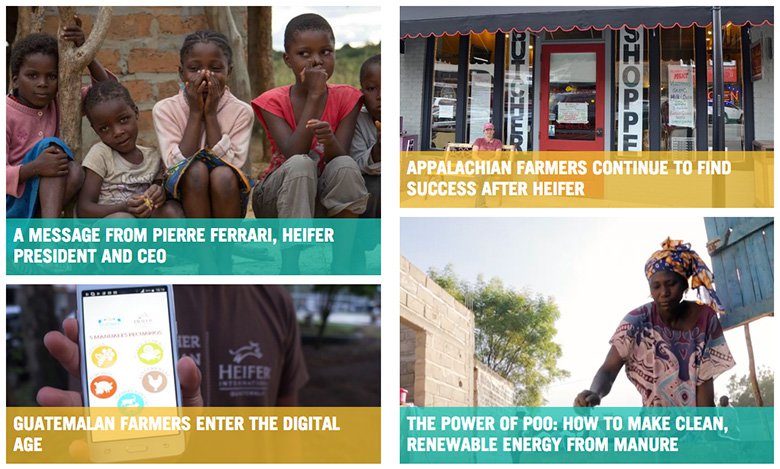
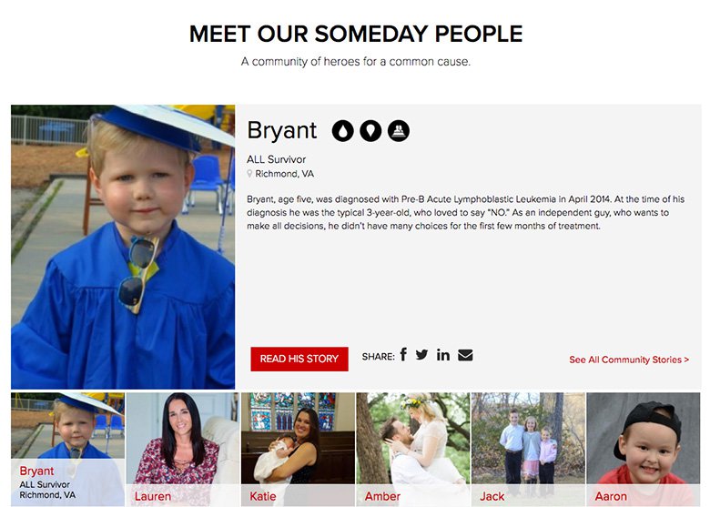

6. Newsletter opt-in
All 9 of the sites we looked at had prominent email signup forms on their home pages.


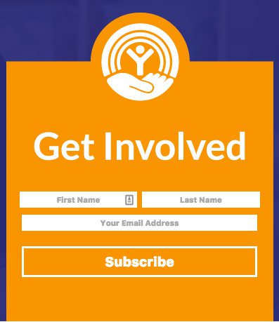

Many visitors may just be beginning to engage with the non-profit and are not ready to commit to a donation. This is a perfect time to allow them to take the first step by signing up for email. From there, the non-profit can develop a relationship with the subscriber and work to get a donation after building trust.
According to a study conducted by SalesForce Marketing Cloud, 66% of online consumers have made a purchasing decision as a result of an email message.
In the examples above you’ll notice some organizations simply asked for the email address, others asked for name and email, and others asked for quite a few fields to be filled. The less fields the better in terms of conversion rate optimization. We recommend limiting to just email address and maybe first name; then when you send a welcome email to new subscribers you can ask them to fill out more information.
See our blog post here if you’re interested in getting started with email marketing.
Conclusion
It’s important to have a web presence where your visitors feel secure. Design and site performance are key ways to establish trust with your visitors.
13% of people will abandon online transactions due to security concerns according to KissMetrics' "5 Ecommerce Stats That Will Make You Change Your Entire Marketing Approach”.
Having a well-designed website that functions as the user expects it to shows your non-profit is trustworthy, and ultimately, will result in more donations.
According to KissMetrics' "How Loading Time Affects Your Bottom Line”, website performance issues cause 79% of users to be less likely to complete future transactions.
Of course, no matter how well-designed the website is and how great a conversion rate it yields in terms of getting viewers to click the "donate" button, it ultimately comes down to the donation process to see the conversion through to an actual donation.
There are many options non-profits can use to process payments. PayPal is the simplest to set up, but there are many other free and low-cost donation tools out there. There are also companies set up to help larger non-profits process payments including Classy.org, Donate.ly, WeDid.it and many more.
Most larger fundraising software companies such as the ones above will have donation pages optimized for conversions. If you’re setting up your own, be sure to limit the amount of required fields, consider breaking donation forms up into multiple steps, and in general just keep the process as quick and as simple as possible.
Need help with a website for your charity or non-profit? We specialize in websites for non-profits and community organizations and would be happy to give you a free consultation to discover how we could best partner with you!
Back To All Posts?