5 Ways to Turn an Error into an Opportunity: Designed 404 Pages
A 404 page is what a user sees when they attempt to navigate to a page that doesn’t exist on a website. It’s a necessary component of any website, but why not use it for something more than just an error message?
We’d like to think hardly anyone will ever see our 404 page, right? But in reality, someone at some point will. Why not use that opportunity to surprise and delight your audience? Here are 5 ways to turn a 404 error page into an opportunity to strengthen your brand and engage with your audience.
1. Let your personality shine through in the messaging.
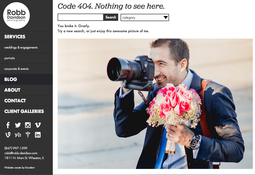
Here’s an example from our client Robb Davidson’s new website. His humor is sprinkled throughout the site; why shouldn’t it be on the 404 page?
2. Appeal to the interests of your audience.
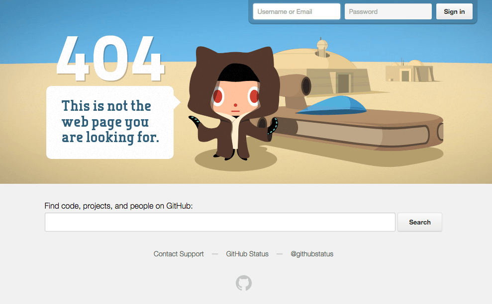
GitHub, an online resource for developers (think nerds), uses a Star Wars parody for their 404 page.
3. Use themes from your brand.
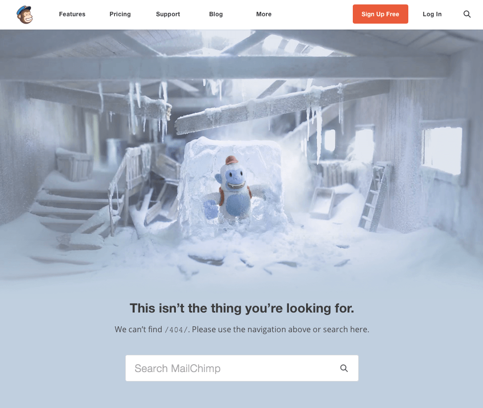
MailChimp is known for their quirky humor, and while we’re not exactly sure what is going on in their 404 page, we do know it’s on-brand!
4. Mix sincerity with humor.
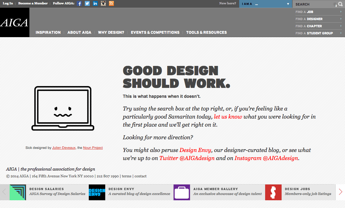
AIGA, the professional association for design, states a design truth that appeals to their audience while also admitting something has gone wrong.
5. Help the user find their way.
All of these examples direct the user to a way to move forward by searching the site for what they were originally looking for. Giving the user a next step is vital so they don’t give up and exit your site.
Have you seen any good 404 pages lately? Leave them in the comments!
P.S. – Here’s what our 404 page looks like.
Back To All Posts?


