5 Big Brands Use Animated GIFs in Emails in a Not-So-90s Way!
Have you noticed a lot of animated GIFs in emails lately? We sure have! We’ve seen animated GIF’s coming from big and small brands alike.
When most people think of animated GIF images, thoughts of terrible 90s “designs” come to mind. As these brands demonstrate, animated GIFs are making a not-so-90s comeback! And with all the technological constraints of email marketing, GIFs are just the thing marketers needed to surprise and delight their subscribers.
Here are 5 big brands using animated GIFs frequently as well as a couple smaller companies that have jumped on this trend successfully.
Click the thumbnail images below to view the full email and the animated GIF!
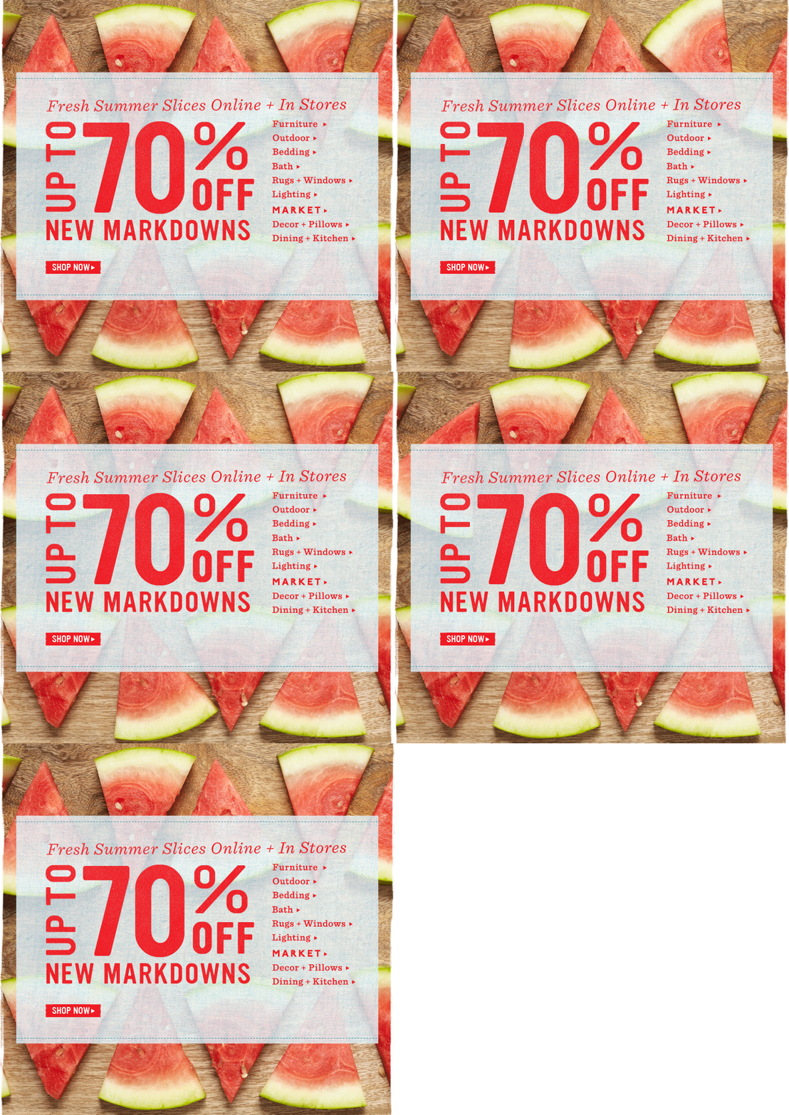
1. Bed Bath & Beyond
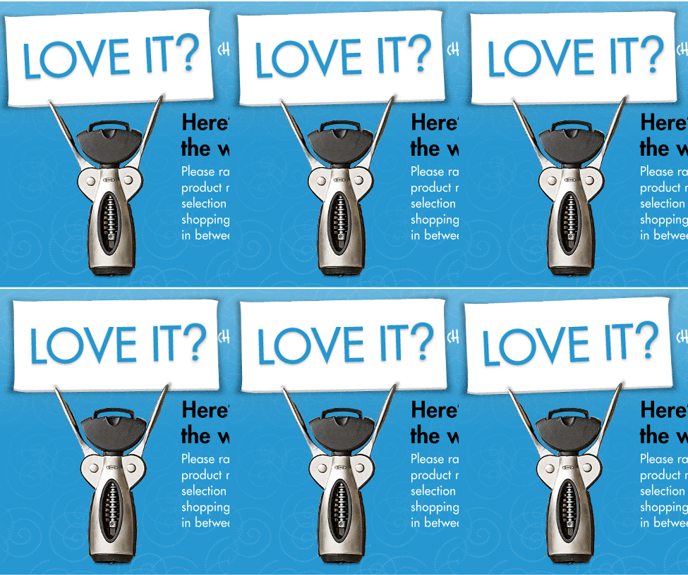
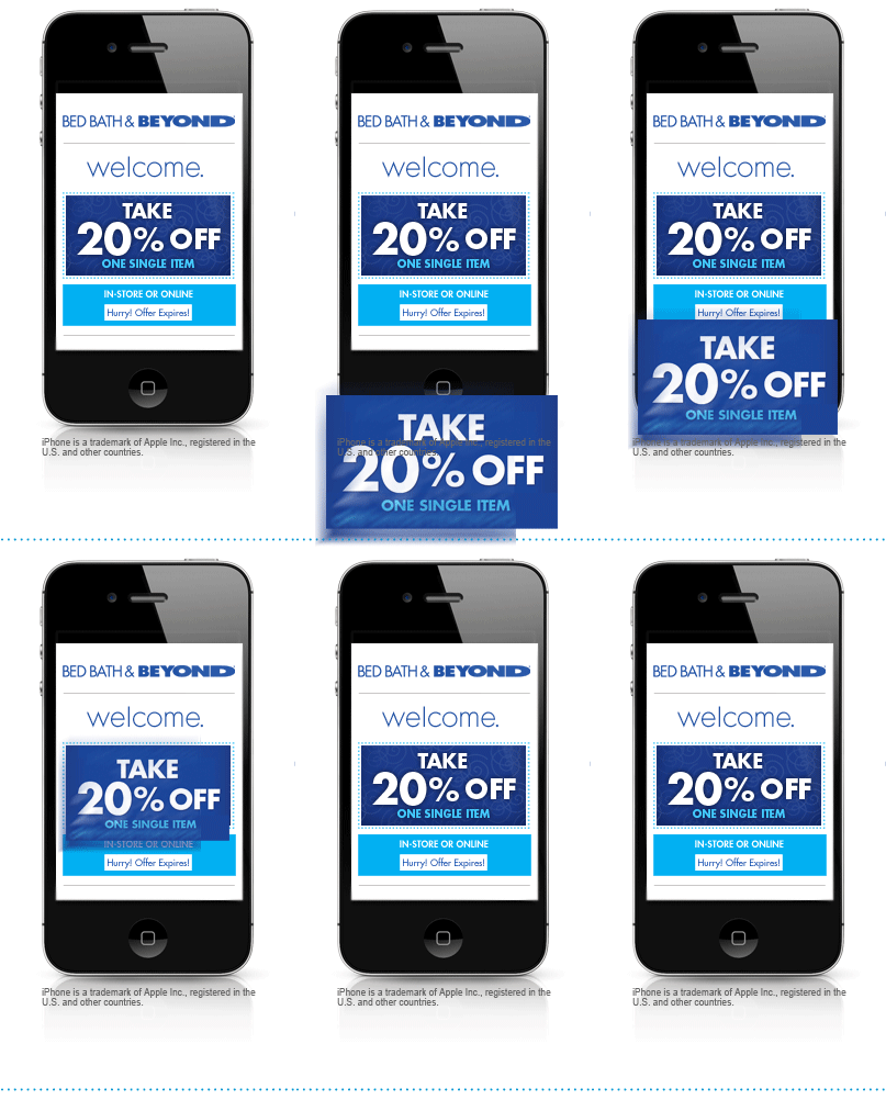
Bed Bath & Beyond uses animated GIFs in their emails as a creative way to add a little flair to their designs.
2. Myspace (The NEW Myspace)
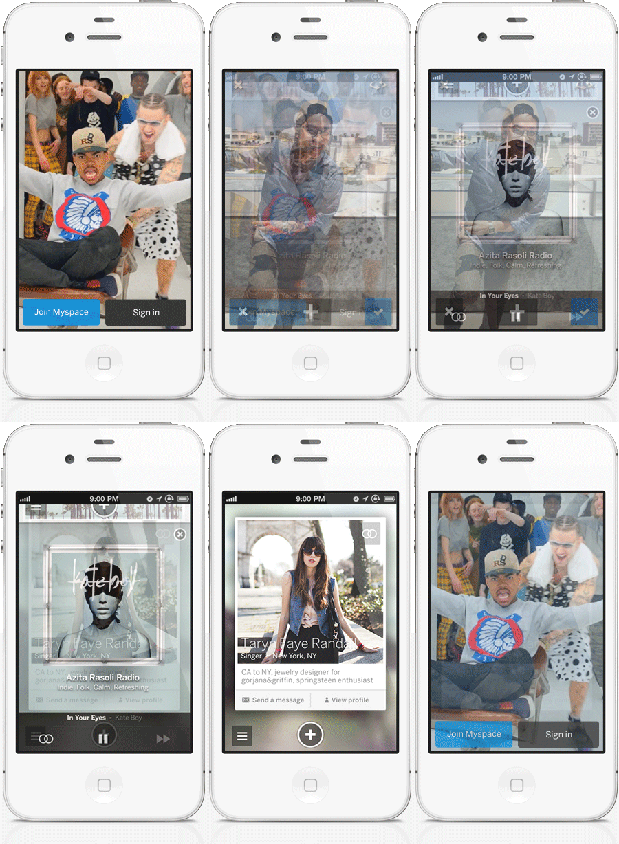
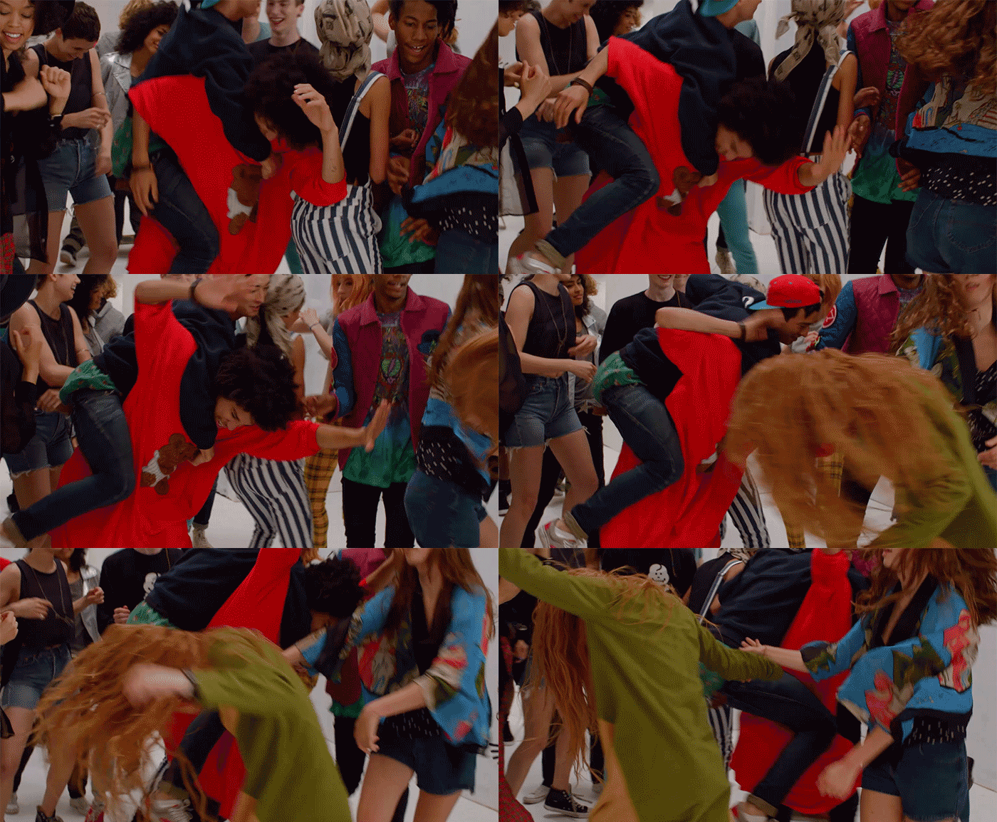
For the new Myspace, animated GIFs provide a way to show multiple views – like the first example of a smartphone screen, or to simply surprise and delight – like the second example is sure to do.
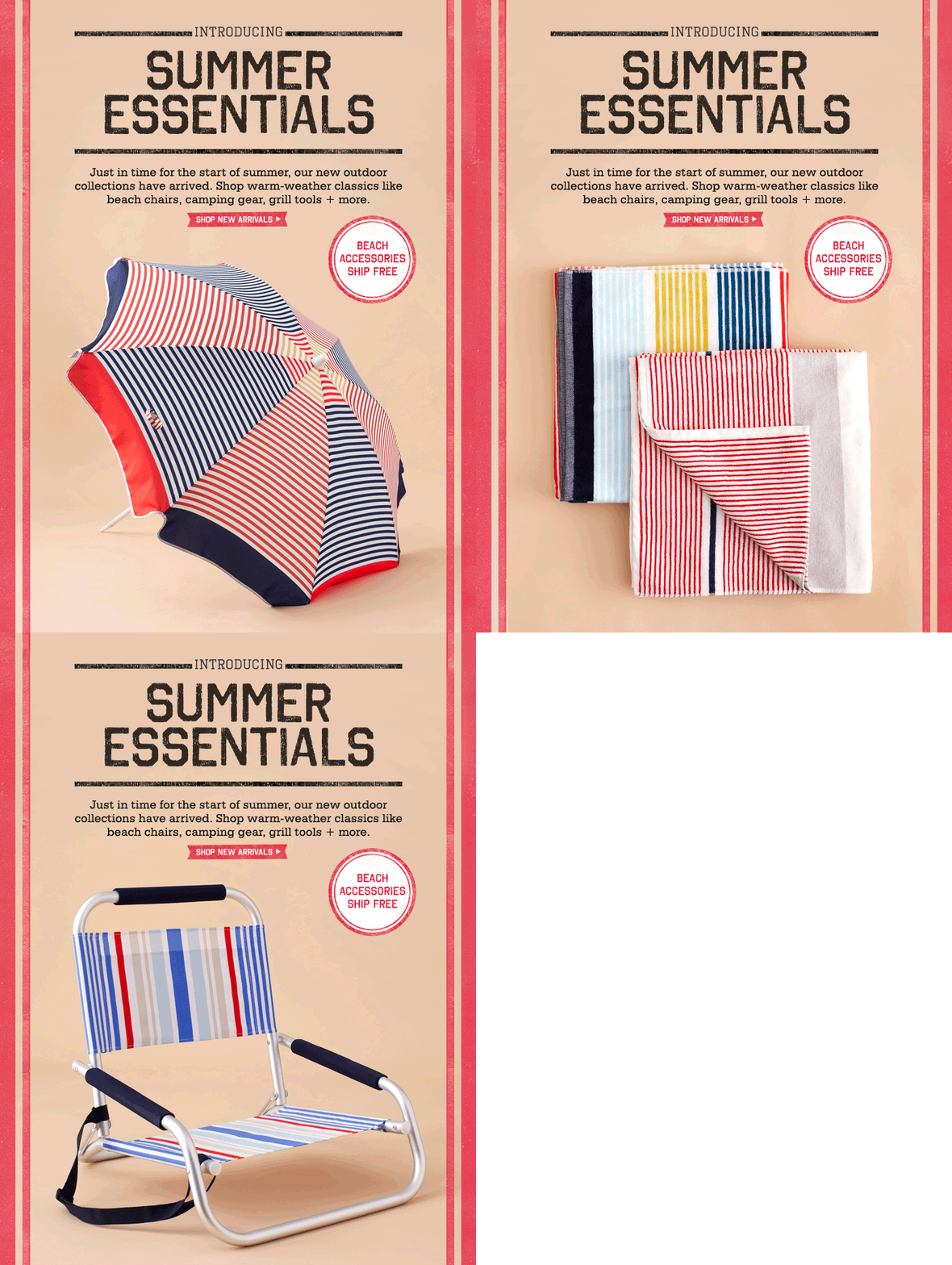
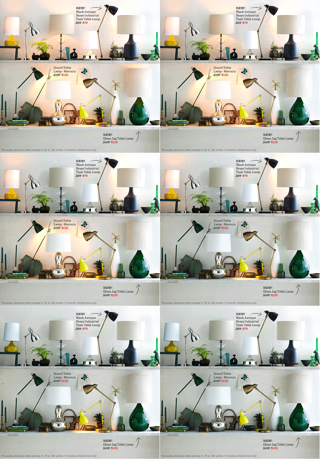
3. West Elm
West Elm uses animated GIFs to both add interest visually, and also to showcase multiple products (see the second example below). The lamp email, in my opinion, is the most creative use of an animated GIF in an email I’ve seen yet.
4. Starbucks
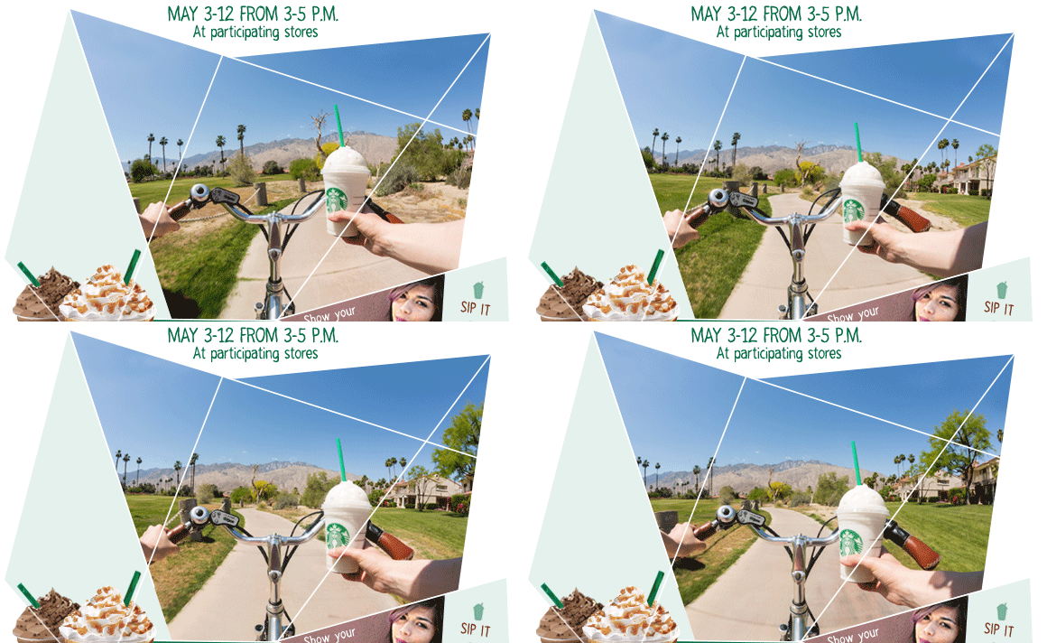
This example is from Starbucks’ current ad campaign. The very distinct design style which uses fragmented, rectilinear shapes helps to make the animated GIF used in this email and on their website even more interesting.
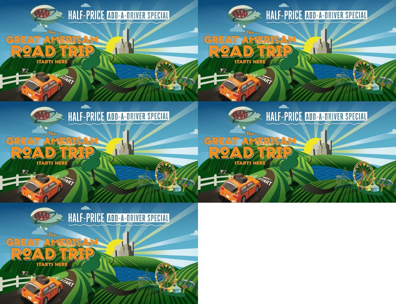
5. AAA Ohio Auto Club
AAA Ohio has used a few animated GIFs in their recent emails to add a little something extra to the header images used.
In full disclosure, I was the designer of these two emails.

Which use of an animated GIF is your favorite? Have you seen another big or small brand that’s been using animated GIFs successfully? Leave them in the comments!
Back To All Posts?